UX Researchers: Two Interns + Two Contracters
UX Designer: One
Timeline: Jan 2019 - April 2019
Tools: Zoom & Research Methodologies
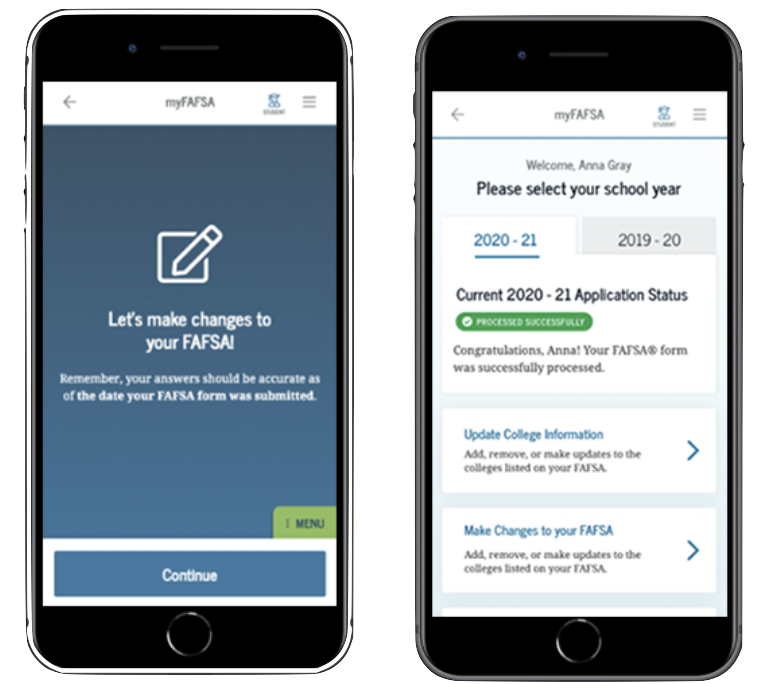
The FAFSA form needed to be accessible from different devices other than just the desktop so the Office of Federal Student Aid decided to do a redesign of the FAFSA form on different devices. My team was responsible for research on the form on the mobile devices./p>
The user experience weren't the most ideal on the FAFSA and some problems included:
1) Not many people knew they could fill out FAFSA on their mobile device.
2) The Information Architecture was messy and confusing.
1) Launch the mobile form before the academic year so students can access it.
2) Make sure the experience is optimal by conducting extensive research on it.
My team and I interviewed 10 students ranging from undergrades to graduate students. There were also a freelance researchers team conducting research alongside us.
We formulated a discussion guide to see what the students wanted in the mobile app but most importantly to see if they prefered filling out the FAFSA form on their phone over their computers.
We conducted 10 different usability tests and all of them were done remotely. We had the students share their screen and we sent them the link of the prototype.
Suprisingly most students prefered using the phone to fill out the form. We suspected that they would like do it on their computers just in case they needed to upload documents. However, many thought that using their phone was more ideal. They also mentioned the overall process and user experience on the phone was simpler in comparison to the computer.