UX Researchers: Two Interns + Two Contracters
UX Designer: One
Timeline: Sep 2019 - Present
Tools: Zoom & Research Methodologies
Intro
Federal Student Aid (FSA), an office of the U.S. Department of Education, is the largest provider of student financial aid in the United States.
I worked on the Next Gen initiative which is a new regime that simplifies FSA and takes big steps toward improving the way students, parents, and borrowers interact with and access the benefits of the programs administered by FSA.
Problem
The Federal Student Aid office needed a redesign of their website and therefore needed some UX Researchers to help find specific issues that needed to be fixed. The main problems with the old site was that:
1) The system is complex and expensive.
2) Not user friendly and caused information overload.
3) If a borrower defaults, their account goes through multiple handoffs, pinging from a servicer to a default management company to at least one private collection agency (PCA).
4) FSA lacks access to servicers' and PCAs' back-end information systems, which are owned and maintained by the companies. If FSA requires information, it must put together a detailed request and, in some cases, pay for the extra work the contractor must perform.
5) Considering that borrowers normally have more than one loan servicer, each servicer maintains its own website, proprietary back-end software, customer service training programs, protocol for counseling borrowers, analytics, and outreach strategies. Managing different loan servicers can be difficult but in addition, when borrowers switch servicers, their account and all of the information attached to it must be correctly transmitted and set up in the new servicer's system which is a process that requires significant manual processing. The borrower also needs to learn to navigate the new system and set up a new login and payment account.
The redesigned site fixed some of the issues mentioned but we're still in the process of conducting more research for the redesign to be complete. The work included here is what we've done so far and will surly be adding more updates as we work on it.
Goals
1) Launch a single website where all 35 million Direct Loan borrowers will manage their accounts, make payments, and apply for repayment programs.
2) Under a single portal, FSA will be able to more easily boot poor-performing contractors from the system with minimal disruption to the borrower, as the account will only need to be assigned to a new entity rather than completely transferred.
3) Borrowers who default on their debts will not be siphoned off into a different system; they will still be able to manage their account and speak with a customer service representative through the same system where they managed their loans while in repayment.
User Segmentation
The team relied on the other intern and I to recruit users to be interviewd. Each of us interviewed 3 users (6 total); one highschool senior, two college freshmen, one college junior, and two graduates. We were aiming for a broad set of users since the website is used by highschoolers, college students, and adults/parents. We also abstained from interviewing students in design based degrees to avoid any biases.
Methods & Approach
Heuristic Evaluation
We created a heurisitc evaluation in order to quickly eye usability problems before conducting any interviews or usability testing. There was 3 main issues we noticed that invovlved repetitivness, design issues, & content placement.
Discussion Guide
We created a discussion guide in google docs with the goal of confirming certian usability issues. Since the discussion guide results was not diagnostic in providing specific details about the problematic areas, we needed to identify the key issues from the user perspective in a comprehensive way to help the product team achieve their business goals.
Usability Testing
Our supervisor sent over a prototype of what the redesign looked like in order conduct some usabilty testing on it. Although there were some issues that the users noticed in the prototype, they mentioned that it was a great upgrade from the old site. We created a PDF synthesis of the usability testing and it can be found here.
Outcomes & Impacts
Impacts
This project was a huge success in advocating for UX research across the office in several ways:
1) Lowered information overload
2) Made it easier to locate the sign up and login buttons
3) Made it easier to locate the FAFSA application
4) Improved other features like making navigation to grants and loans easier.
5) The new site was launched on december 20th, 2019 and we recieved positive feedback from the users although there's plenty of room for improvement.
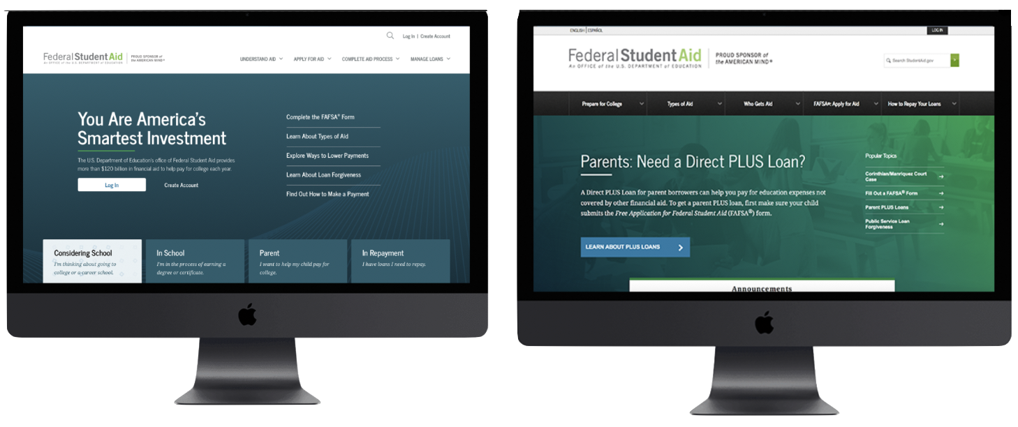
Outcome
Below I have a comparison between the old site (on the right) and the new launched site (on the left).